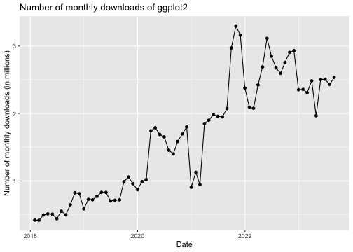
class: center, middle, inverse, title-slide .title[ # Stat 579: Graphics with ggplot2 ] .author[ ### Heike Hofmann ] --- class: inverse, middle, center # Looking at data --- class: inverse, middle, center ## Questions for the fbi data --- ## Plan for answers - Explore how one (or more) variables are distributed: *barchart or histogram* - Explore how two variables are related: *scatterplot, boxplot, tile plot* - Explore how two variables are related, conditioned on other variables: *facetting, color & other aesthetics* --- ## Different version of the data For the exploration, we will use a different shape of the `fbi` data - a wide form: ```r library(classdata) str(fbiwide) ``` ``` ## Classes 'tbl_df', 'tbl' and 'data.frame': 2164 obs. of 16 variables: ## $ state : chr "Alabama" "Alabama" "Alabama" "Alabama" ... ## $ state_id : int 2 2 2 2 2 2 2 2 2 2 ... ## $ state_abbr : chr "AL" "AL" "AL" "AL" ... ## $ year : int 1983 1985 1996 1997 1998 1999 2000 1995 1982 2015 ... ## $ population : int 3959000 4021000 4273000 4319000 4352000 4369862 4447100 4253000 3943000 4853875 ... ## $ violent_crime : int 16471 18398 24159 24379 22286 21421 21620 26894 17653 22957 ... ## $ homicide : int 364 396 444 426 354 345 329 475 417 348 ... ## $ rape_legacy : int 931 1079 1397 1396 1443 1513 1482 1350 1026 1449 ... ## $ rape_revised : int NA NA NA NA NA NA NA NA NA 2037 ... ## $ robbery : int 3895 4237 7124 6931 5698 5297 5702 7900 4417 4612 ... ## $ aggravated_assault : int 11281 12686 15194 15626 14791 14266 14107 17169 11793 15960 ... ## $ property_crime : int 145890 140115 181803 186809 177779 171398 180539 179294 165048 144785 ... ## $ burglary : int 42485 41612 42821 43786 41965 38648 40331 43586 49531 35265 ... ## $ larceny : int 94279 88108 123350 127616 120943 119616 127399 120967 104740 99182 ... ## $ motor_vehicle_theft: int 9126 10395 15632 15407 14871 13134 12809 14741 10777 10338 ... ## $ arson : int 981 1074 944 829 671 589 634 879 1078 770 ... ``` --- ## Scatterplots - need two continuous variables - we'll be using the `ggplot2` framework for plotting --- class: inverse, middle, center # Why `ggplot2`? --- ## Why `ggplot2` - Wildly popular package for statistical graphics: millions of downloads per month <!-- --> --- ## Why `ggplot2` - Developed by Hadley Wickham (An ISU Alumni) - Designed to adhere to good graphical practices - Constructs plots using the concept of layers - Supports a wide variety plot types and extensions <br> - http://ggplot2.org/book/ or Hadley's book *ggplot2: Elegant Graphics for Data Analysis* for reference --- ## Grammar of Graphics A graphical representation (plot) consists of: 1. **mappings** (`aes`): data variables are mapped to graphical elements 2. **layers**: geometric elements (`geoms`, such as points, lines, rectangles, text, ...) and statistical transformations (`stats`, are identity, counts, bins, ...) 3. **scales**: map values in the data space to values in an aesthetic space (e.g. color, size, shape, but also position) 4. **coordinate system** (`coord`): normally Cartesian, but pie charts use e.g. polar coordinates 5. **facetting**: for small multiples (subsets) and their arrangement 6. **theme**: fine-tune display items, such as font and its size, color of background, margins, ... --- ## Scatterplots in `ggplot2` `aes` allows us to specify mappings; scatterplots need a mapping for `x` and a mapping for `y`: ``` ggplot(data = fbiwide, aes(x = burglary, y = homicide)) + geom_point() ``` ``` ggplot(data = fbiwide, aes(x = log(burglary), y = log(homicide))) + geom_point() ``` ``` ggplot(data = fbiwide, aes(x = log(burglary), y = log(motor_vehicle_theft))) + geom_point() ``` --- ## Revision - Interpreting Scatterplots - Big patterns - Form and direction - Strength - Small patterns - Deviations from the pattern - Outliers --- ### **Form** Is the plot linear? Is the plot curved? Is there a distinct pattern in the plot? Are there multiple groups? ### **Strength** Does the plot follow the form very closely? Or is there a lot of variation? ### **Direction** Is the pattern increasing? Is the plot decreasing? *Positively:* Above (below) average in one variable tends to be associated with above (below) average in another variable. *Negatively:* Opposite pattern. --- <img class="cover" src="images/positive.png" alt="" width=500> > 1. <font color="darkorange">Form: Linear</font> > 2. <font color="darkorange">Strength: Strong, very close to a straight line.</font> > 3. <font color="darkorange">Direction: Two variables are positively associated.</font> > 4. <font color="darkorange">No outliers.</font> --- <img class="cover" src="images/negative.png" alt="" width=500> > 1. <font color="darkorange">Form: Roughly linear, two distinct groups (more than 40% and less than 40%.)</font> > 2. <font color="darkorange">Strength: not strong. Data points are scattered. </font> > 3. <font color="darkorange">Direction: Negatively Associated. </font> > 4. <font color="darkorange">Outliers: None.</font> --- ## Aesthetics Can map other variables to size or colour ``` ggplot(aes(x = log(Burglary), y = log(Motor.vehicle.theft), colour=State), data=fbiwide) + geom_point() ggplot(aes(x = log(burglary), y = log(motor_vehicle_theft), colour=Year), data=fbiwide) + geom_point() ``` ``` ggplot(aes(x = log(burglary), y = log(motor_vehicle_theft), size=Population), data=fbiwide) + geom_point() ``` other aesthetics: shape --- class: inverse ## Your turn - Work through each of the example plots - Try variations of the plots to find answers (some of) your questions.