class: center, middle, inverse, title-slide .title[ # Stat 579: More types of graphics with ggplot2 ] .author[ ### Heike Hofmann ] --- class: inverse, center, middle # Looking ... some more ... at data --- ## Outline - Facetting - Boxplots, histograms and barcharts --- ## Getting ready Load libraries: ```r library(tidyverse) ``` ``` ## ── Attaching core tidyverse packages ──────────────────────── tidyverse 2.0.0 ── ## ✔ dplyr 1.1.3 ✔ readr 2.1.4 ## ✔ forcats 1.0.0 ✔ stringr 1.5.0 ## ✔ ggplot2 3.4.3 ✔ tibble 3.2.1 ## ✔ lubridate 1.9.2 ✔ tidyr 1.3.0 ## ✔ purrr 1.0.2 ## ── Conflicts ────────────────────────────────────────── tidyverse_conflicts() ── ## ✖ dplyr::filter() masks stats::filter() ## ✖ dplyr::lag() masks stats::lag() ## ℹ Use the conflicted package (<http://conflicted.r-lib.org/>) to force all conflicts to become errors ``` ```r # not found? run install.packages("tidyverse") library(classdata) # not found? run remotes::install_github("heike/classdata") ``` --- ## Facetting Can facet to display plots for different subsets: `facet_wrap`, `facet_grid` ```r ggplot(aes(x = year, y = homicide), data=fbiwide) + facet_wrap(~state) + geom_point() ``` 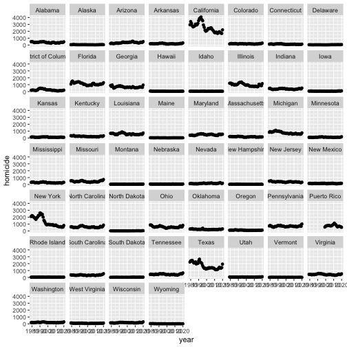<!-- --> --- ## Setup of `facet_wrap` and `facet_grid` - `facet_grid` has formula specification: `rows ~ cols` - `facet_wrap` has specification `~ variables` - multiple variables (in either specification) are included in form of a sum, i.e. `rowvar1 + rowvar2 ~ colvar1+ colvar2` - no variable (in `facet_grid`) is written as `.`, i.e. `rowvar ~ .` are plots in a single column. --- class: inverse ## Your turn Use the `fbiwide` data from the package `classdata` for this your turn. - Plot the number of car thefts by year for each state (facet by state). - The numbers are dominated by the number of thefts in California, New York, and Texas. Use a log-scale for the y-axis. Does that help? - Another approach to fix the domination by CA, TX and NY: Read up on the parameters in `facet_wrap` to find a way to give each panel its own scale. Comment on the difference in the results. --- ## Facets vs aesthetics? - Will need to experiment as to which one answers your question/tells the story best - Rule of thumb: comparisons of interest should be close together --- ## Boxplots 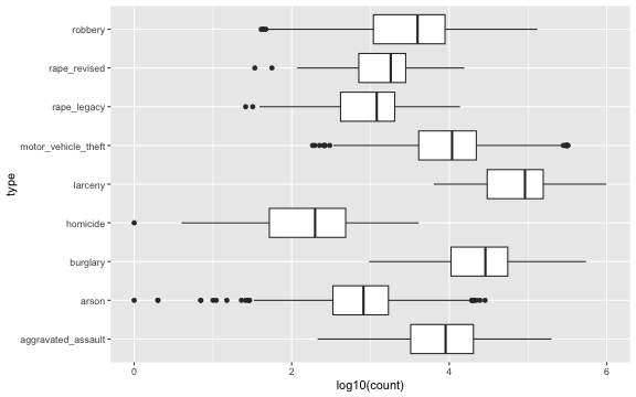<!-- --> --- ## Boxplot definition - definition by J.W. Tukey (1960s, EDA 1977) 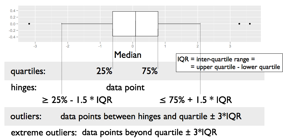 --- ## Boxplots - are used for group comparisons and outlier identifications - usually only make sense in form of side-by-side boxplots. - `geom_boxplot` in ggplot2 needs `x` and `y` variable (`y` is measurement, `x` is categorical) ```r ggplot(data = fbi, aes(x = type, y = log10(count))) + geom_boxplot() + coord_flip() ``` ``` ## Warning: Removed 2002 rows containing non-finite values (`stat_boxplot()`). ``` 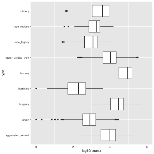<!-- --> --- class: inverse ## Your turn - Using ggplot2, draw side-by-side boxplots of the number of robberies by state. Use a log transformation on y and compare results. - Compare *rates* of robberies by state, i.e. adjust robberies by the state population. Then plot side-by-side boxplots. --- ## Boxplots - Pros and Cons - **Pros:** - Symmetry vs Skewness - Outliers - Quick Summary - Comparisons across multiple Treatments (side by side boxplots) - **Cons:** - Boxplots hide multiple modes and gaps in the data --- ## Histograms ```r ggplot(fbiwide, aes(x = motor_vehicle_theft)) + geom_histogram(binwidth=5000) + ggtitle("binwidth = 5000") ``` 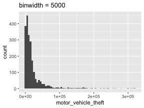<!-- --> --- ## Histograms ```r ggplot(fbiwide, aes(x = motor_vehicle_theft)) + geom_histogram(binwidth=1000) + ggtitle("binwidth = 1000") ``` 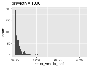<!-- --> Always change the bin width! There is no perfect bin width, but a lot of different views of the data at different resolutions! --- ## Barcharts What does this plot tell us? ```r ggplot(fbi, aes(x = type)) + geom_bar() + coord_flip() ``` 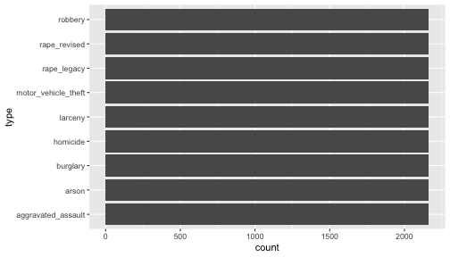<!-- --> --- ## Barcharts What does this plot tell us? ```r ggplot(fbi, aes(x = type)) + geom_bar(aes(weight= count)) + coord_flip() ``` 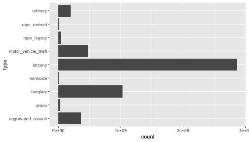<!-- --> --- ## Weighted vs Unweighted Barcharts Unweighted/regular barchart: categorical variable `\(X\)` with `\(K\)` levels: `\(x_1, ..., x_n \in \{C_1, ..., C_k\}\)` A weighted barchart has an additional numeric variable `\(W\)` of weights `\(w_1, ..., w_n\)` with `\(w_i \ge 0, 1 \ge i \ge n\)`. Mathematically, both barcharts are a visualization of a set of tuples of the form `\((C_k, y_k)\)`, where for `\(1 \ge k \ge K\)`: regular barchart: `$$y_k = \sum_{i=1}^n I{(x_i = C_k)}$$` Weighted barchart: `$$y_k = \sum_{i=1}^n w_i \cdot I({x_i = C_k})$$` where `\(I\)` is the indicator function, i.e. `\(I(x) = 1\)` if `\(x\)` is true, and `\(I(x) = 0\)` if `\(x\)` is false --- ## Histograms and barcharts What do we look for? - Symmetry/Skewness - Modes, Groups (big pattern: where is the bulk of the data?) - Gaps & Outliers (deviation from the big pattern: where are the other points?) For the histogram, always choose the binwidth consciously In a barchart, choose the order of the categories consciously (later) --- class: inverse ## Your turn - Use the `fbi` data set to draw a barchart of the variable `Violent Crime`. Make the height of the bars dependent on the number of reports (use `weight`). Then facet by type (does the result match your expectation? good! get rid of facetting). Color bars by `Type`. - Use the `fbi` data set to draw a histogram of the number of reports. Facet by type, make sure to use individual scales for the panels. --- ## More on `ggplot2` - reference/document: http://ggplot2.tidyverse.org/reference/ - RStudio cheat sheet for [ggplot2](https://www.rstudio.com/wp-content/uploads/2015/03/ggplot2-cheatsheet.pdf) - ggplot2 mailing list: https://groups.google.com/forum/?fromgroups#!forum/ggplot2